UX Team of One
It has been a long time since I published my last case study. During this period, I explored other career paths, such as filmmaking, social media management, and targeting management. However, I am now returning to the UX field.
Even though I ventured away from UX, I consistently applied UX principles and methodologies to non-UX roles. This period of self-reflection reinforced my passion for UX and confirmed that this is the career path I want to pursue.
So, why did I decide to do this “case study”?
Trying to get back on track, I listened to the Norman Group UX Podcast featuring Garrett Goldfield on how to be a One-Person UX Team. Much of what he said resonated with my experience working in a small-size company as a solo UX professional, and I wanted to share how being the UX team of one requires a slightly different approach.
1. Understanding the Organization and Colleagues
Garret said, “As a UX professional, we often try to understand who our end-users are to create better systems for their needs.” However, as a one-person UX team, it’s equally important to understand colleagues and stakeholders to integrate UX processes seamlessly into the organization. Other teams are unlikely to adjust their workflows for a single UX professional.
In simple terms, we need to effectively communicate the value of UX to help other teams understand why certain decisions are necessary, while also being empathetic to their processes to ensure efficiency and collaboration.
Before even receiving a job offer, I took the initiative to demonstrate the importance of UX to the CEO:
- Usability testing
- I conducted basic usability tests, positioning myself as a client to evaluate existing features and functionality. - Simple Heuristic Analysis
- I went through each page and made an evaluation based on looks, readability, consistency, efficiency, and content.
Main issues I found:
- The company didn’t seem to cater to target users.
- Though the main users are Russian-speaking people, the website was opened in English. Users had to change the language every time they opened the website. - The site didn’t seem consistent.
- The design appeared formal and professional, but the tone and wording were informal.
- Some images contained embedded text that did not change when switching languages.
- Although aiming for minimalism, the visuals appeared cluttered.

- The designs were confusing
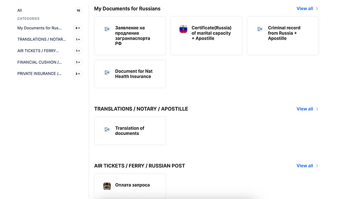
- For example, the use of numbers and connecting lines implied a process flow, which was not suitable for listing the company’s services. Users had to navigate through the entire list to find what they needed, which is inefficient and risks losing potential clients due to time constraints. And we all know that a user’s time is precious and can cost us money.

- The Services page, being a critical section, must offer an efficient and seamless experience. However, the “Categories” column occupied too much space unnecessarily. Additionally, the “View All” option forced users to navigate to another page just to check available services, potentially leading them to abandon the site in favor of competitors due to the extra effort required.
- Visibility of System Status
- As the Nielsen Norman Group emphasizes, “The design should always keep users informed about what is going on through appropriate feedback within a reasonable amount of time.”
- On the website, users must sign in to upload documents when ordering a service, but there was no indication of this requirement. I struggled to understand why the upload feature wasn’t working, leading to frustration and the impression that the site was broken — potentially driving users away.
- The error messages were in the form of a code and were not easy to understand for users.

There were a lot of other things I included in the analysis, but I will spare you of details. Anyway, you can get the gist of it.
(And it was just the customer site.)
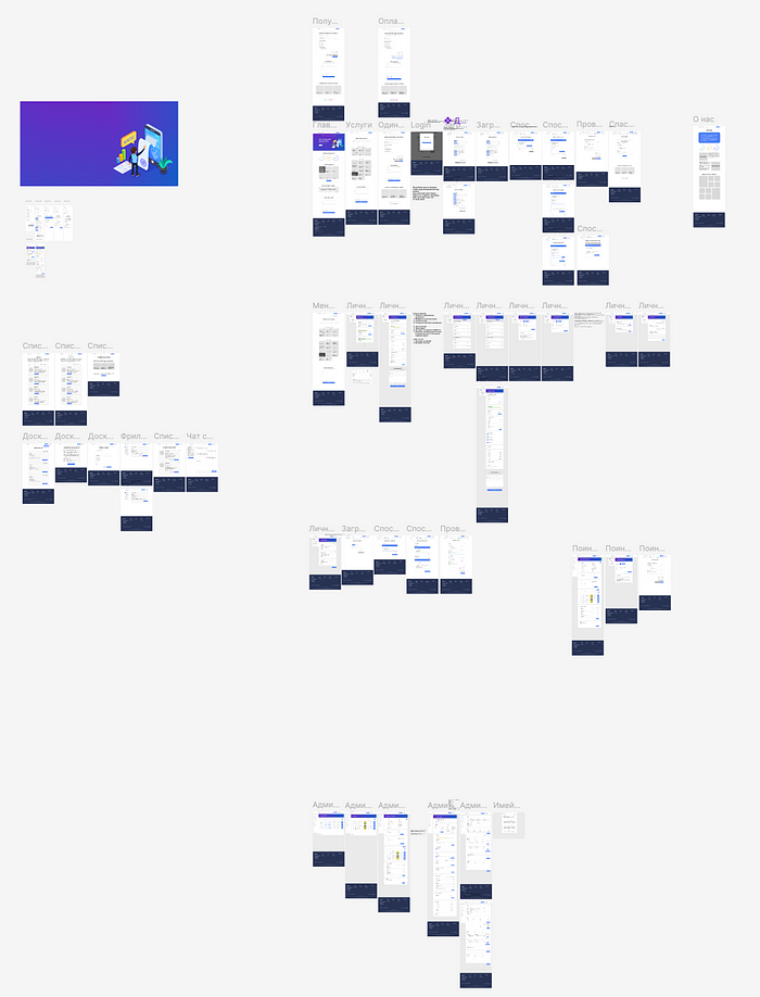
The admin site was almost nonexistent and had to be built from scratch. But, sometimes, starting from the ground up is more efficient than attempting to fix a poorly built product.
Based on this analysis, the CEO realized how poorly maintained the site was before. He saw the potential that the UX team could bring (even if it’s a team of one) and hired me.
2. Adjusting the processes
One of the challenges I faced as a one-person UX team was my manager’s constant push for quick results without fully understanding the need for user testing and iterative design, which can be time-consuming.
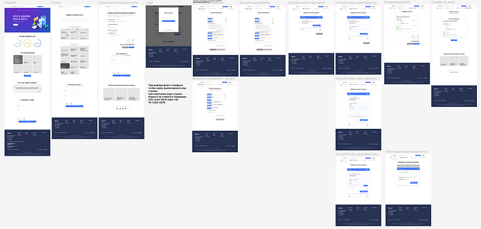
Acknowledging these time constraints, I created a faster process involving quick usability tests and daily iterations. However, this also meant the sole developer had to juggle multiple tasks, causing occasional delays.
With my background in Full-Stack development, I understood the constraints the developer had, and we brainstormed ideas for better and more efficient ways to push designs into production.
Given how much we had to do, we developed a system of priorities.

We used Trello to identify the status of work.
Let’s call one group of work a “mini-project.”
- Haven’t started
- Mini-projects not yet started, with assigned priority levels and people in charge. - In progress
- Ongoing mini-projects. - Under Review
- Completed mini-projects awaiting my testing and feedback. - Revision
- Items needing developer revisions based on my testing results. - Finished
- Completed and approved mini-projects, tracked for C-level summaries. - Call Notes
- Weekly video calls with detailed notes, screenshots, and follow-up actions.
Trello wasn’t just a tool for the developer and me to assign work; it served as a communication tool with managers, demonstrating our progress and justifying UX efforts through documented testing.
Working as a UX team of one, it’s important to communicate the importance of the work you do. Otherwise, managers would think that it’s not necessary and a waste of time.
Many managers who haven’t worked with the UX team before think that our work is about visual design, but they don’t know the process that was put into creating a design, so having something to represent the process makes managers understand the value of UX.
3. Career Growth and Skills
- Being a solo UX designer requires dynamic management skills, multitasking, and proactive planning. In this case, I’m not just managing the UX processes; I’m managing the developers and myself as a UX designer.
- The key skill is being able to do everything while being efficient and being your own administrator. It’s about being ready to jump on different projects and wearing multiple hats.
- There is no linear career path for a solo UX designer. When wearing multiple hats, it’s hard to say what the next step of your career will be, and the problem is that you cannot focus only on one or a few things that interest you.
- The good thing is that as the company grows, you can expand your team and hire people who can complement your work. But not all companies have resources. In this case, even if you communicate the need to expand the team well, the company might refuse to do it.
- Another problem is getting burnt out. In my case, I did research, usability testing, content creation, and content translation on top of SMM, targeting, and social media content creation (writing scenarios, shooting, and editing.) I was very passionate about everything and had to shoot on the weekend and edit the videos at night, so eventually, I burnt myself out.
- While I was doing everything simultaneously, the overall process took longer than expected. It was hard to build the site fast, given that we had only one developer working part-time, so we had to push the deadlines several times.
Being proactive.
As a UX team of one, we don’t have time to sit around waiting for the next request.
We must think ahead, whether it’s planning the next usability test, preparing research documents, or designing new features. While the developer worked on mini-projects, I continually reviewed completed work, tested web pages and features, and created high-resolution designs using the library I built initially.
Being a solo UX practitioner can be both enjoyable and empowering, but it demands a high level of commitment and responsibility. If your designs fail to deliver or you struggle with effective communication with managers and colleagues, the value you bring to the team may not be fully recognized.
That said, the overall approach and processes align closely with those of a larger UX team, with attention to a few key considerations I discussed earlier being essential for success.
Thank you for your time!
Happy UX Designing!
Nastya Kvak
